

How to Set Up an Online Fundraising Page That Converts
Your board wants an online fundraising page live before the next campaign email goes out. Meanwhile, you're wondering whether donations will reach the right fund, recurring gifts will reconcile properly, and mobile donors will abandon the form.
The practical answer to how to set up an online fundraising page is to treat it as a checkout funnel, not a brochure. Build one focused appeal, remove unnecessary friction, test every accounting handoff, and track completed gifts after launch.
Quick Answer: How to Set Up an Online Fundraising Page
Set up an online fundraising page as a checkout funnel, not a brochure. Choose one outcome, one audience, and one offer, then test payments, receipts, designations, and the ledger before launch.
Start with nonprofit donation page best practices and fundraising. For setup, see donation pages.
Why Your Fundraising Page Needs to Work Hard
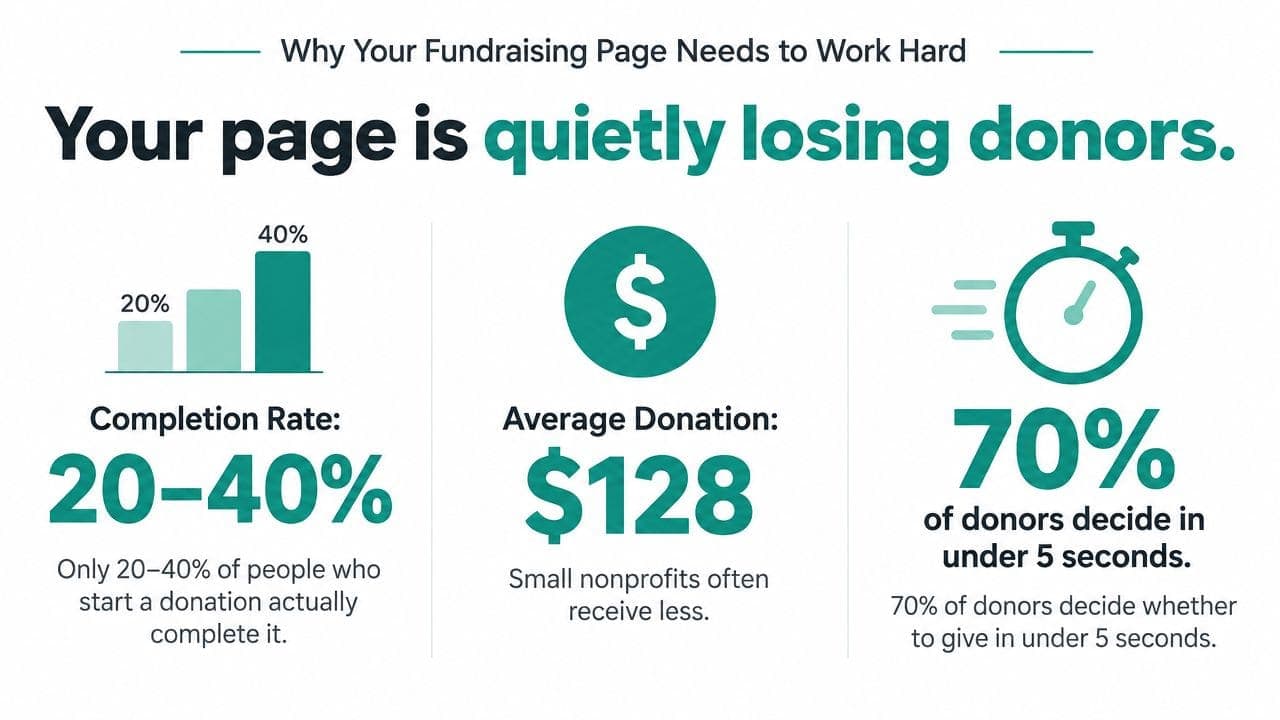
A donation page can look polished and still lose revenue. The problem usually isn't the logo, colors, or campaign photography. It's the extra field, unclear ask, missing payment option, or mobile layout that makes a donor stop before submitting.
Online giving is already a core revenue channel. By 2024, 67% of nonprofits worldwide accepted online donations, and online giving represented 13.4% of revenue for small nonprofits, 8.3% for medium nonprofits, and 4.1% for large nonprofits, according to online fundraising benchmark data from NPTechForGood. Your page isn't an experiment. It's part of your operating model.
Practical rule: Decide what the page must accomplish before choosing its template.
Useful targets include first-time donor conversion, recurring gift enrollment, average gift size, or revenue per visitor. Each target changes the form. A recurring donor appeal needs a visible monthly option, while a rapid-response campaign may need the shortest possible one-time checkout.
Benchmark data makes the operational point clear. M+R reported donation-page conversion rates of about 11% on desktop and 8% on mobile, while another nonprofit benchmark reported a 0.61% website-session-to-donation conversion rate and a $106.71 average gift size. These figures appear in RallyUp's summary of online fundraising benchmarks. Most visitors still won't give, so page performance matters more than page existence.
Set the success measure first. Then make every headline, field, suggested amount, and button support that measure.
Planning Your Page Before You Build
The fastest way to build the wrong page is to open a template before making basic decisions. Write a short campaign brief first, and keep it visible while staff and board members review the page.
Choose one outcome
A page should ask visitors to complete one primary action. That might mean starting a monthly gift program, funding a defined campaign, or bringing lapsed donors back.
Don't combine a capital appeal, emergency need, volunteer recruitment, and newsletter signup on one checkout page. Secondary links create competing choices, especially on a phone.
Name the audience
Choose one audience segment with a clear reason to care today. Existing donors, parents, congregants, alumni, event attendees, and first-time supporters need different language.
An existing donor may respond to progress and continuity. A first-time visitor needs immediate clarity about who benefits and what their gift will make possible.
Write the offer
Give the campaign a name that explains the need. Add a deadline, matching-gift window, or concrete result when one exists.
Your story doesn't need theatrical language. It needs to answer who benefits, what problem exists, why this moment matters, and what the donor can do.
Fix the form decisions
Decide the currency, suggested gift amounts, recurring setting, fund designations, and thank-you experience before building. These choices affect both conversion and financial reporting.
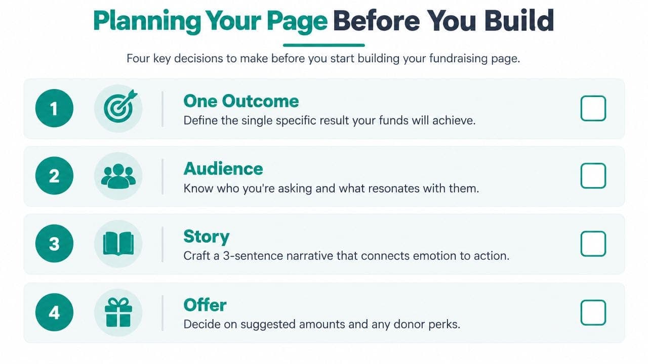
Put those decisions on a one-page brief. It prevents late requests from turning a focused donation page into a general-purpose website.
Setting Up Payments, Fees, and Recurring Giving
Payment configuration determines what reaches your bank account and how easily your finance team can reconcile it. Choose a processor with a direct integration to your fundraising platform, rather than connecting Stripe or PayPal through an improvised workaround.
Direct connections generally make receipts, refunds, recurring billing, and donor records easier to manage. You still need to confirm settlement timing, refund handling, and how restricted gifts appear in reports.
Make fee policy explicit
Choose one fee policy and document it. You can absorb processing costs, offer donor fee coverage, or let the donor choose.
A checkbox that explains the choice clearly is better than a surprise at checkout. Your finance team should know whether the gift amount, covered fee, and net deposit post separately or together.
| Configuration Choice | Option A | Option B | Trade-Off |
|---|---|---|---|
| Processing fees | Your nonprofit absorbs them | Donor covers them | Donor coverage protects net revenue, but may add checkout hesitation |
| Recurring gifts | Monthly option is prominent | Monthly option requires an extra selection | Prominence can increase awareness, while clarity protects donor choice |
| Payment rail | Card checkout | Digital wallet or bank payment | Wallets reduce typing, while bank payments may suit larger gifts |
| Gift designation | Unrestricted default | Donor selects a restricted fund | Choice supports intent, while unrestricted defaults protect general operating revenue |
Configure recurring giving carefully. Make the monthly option prominent, show the amount plainly, and provide an easy way for donors to manage or cancel it.
Add Apple Pay, Google Pay, and Link where your processor supports them. Digital wallets reduce typing on mobile devices, which matters because recent reporting placed mobile giving at 43% to 45% of online donations, as summarized by Business Initiative's nonprofit fundraising trends data.
Before launch, confirm whether ACH or direct debit fits your donor base. Check that receipts include your tax ID, mailing address, and the wording your accountant needs for restricted and unrestricted gifts. Your page should also pass payment data into the ledger without forcing staff to rekey transactions.
Use the AlignMint payment management documentation as a checklist for payment records, refunds, and reconciliation requirements.
Building the Form Fields That Actually Convert
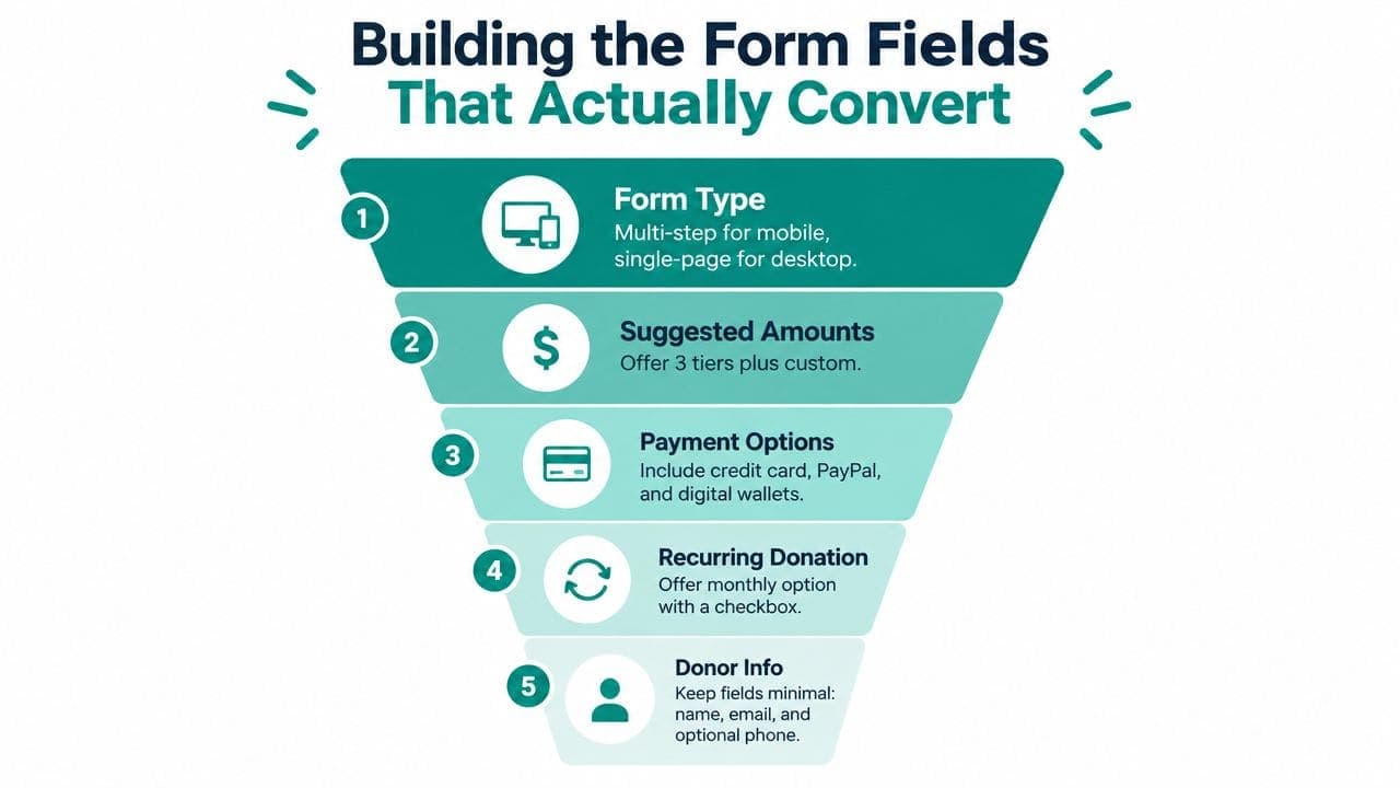
A donor on a phone should reach payment without fighting the form. Build around the device first, then remove every field that does not complete the gift, support stewardship, or satisfy compliance. The form is a checkout funnel, so each extra decision needs a clear operational reason.
Choose the right form structure
Use a multi-step form when mobile donors face several decisions. Separate screens can make the process easier to scan. A single-page form can perform well on desktop when the field count stays low and the layout remains orderly.
Test both versions with real traffic. Track completed gifts against page visits, and separate desktop results from mobile results. The conversion guidance from 4aGoodCause supports reducing confusion, distraction, and friction throughout the giving path.
Suggested amounts should reflect your usual gift range and include one higher option. Keep a custom amount field visible. Too many presets force donors to compare instead of giving.
Keep the form connected to the systems staff use after checkout. Pass the transaction, designation, donor record, and receipt details into your accounting system and CRM, so staff do not rekey gifts or lose the donor's intended fund.
Keep donor information lean
Collect only information that supports payment, receipting, stewardship, or a defined matching-gift workflow:
- Name and email: Use them for receipts, identity matching, and follow-up.
- Billing address: Request it when the processor requires it for fraud prevention or payment validation.
- Phone number: Make it optional unless your relationship plan depends on it.
- Employer match: Add a company lookup when your CRM can process matching-gift records.
- Fund designation: Use a dropdown for multiple programs, with unrestricted as the default when appropriate.
Email quality affects receipts and duplicate records. If typos regularly reach your database, an Email Validation API can check addresses before they enter your CRM. Do not add a verification interruption to every gift unless the error rate justifies it.
Review designation rules with finance before launch. Donors need meaningful choices, while the ledger must distinguish restricted revenue from general operating support. A campaign progress indicator can support momentum, provided it does not push the donate action below the primary form controls.
Make fee coverage an opt-in checkbox. Keep one high-contrast donate button above secondary actions. For a practical starting point, review this donation form sample, then test suggested amounts, field order, and optional fields before cosmetic changes.
Branding, Copy, and the Above-the-Fold Layout
Donors decide whether to continue before they read your full campaign story. Your first screen needs to explain the outcome, establish credibility, and show the next action without making visitors scroll.
Lead with a specific result. “Send children to summer reading camp” tells donors more than “Support our mission.” Keep the supporting line short, direct, and connected to the immediate need.
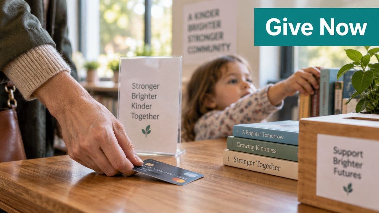
Use one genuine photograph of beneficiaries, staff, or the work in progress. Stock images of hands, hearts, and generic celebrations may match your color palette, but they don't give donors evidence of your actual work.
Put trust beside the ask
Place trust signals directly below the headline or donation selector. Depending on what your organization has, those signals might include:
- Identity details: Show your EIN, legal name, and mailing address.
- Financial transparency: Link to audited financial statements or relevant financial reports.
- Independent validation: Display a charity evaluation seal when the listing is current.
- Human reassurance: Add a brief donor testimonial with a real name and city.
The donate button must contrast against its background at WCAG AA. Match your established brand, but don't sacrifice visibility to satisfy a palette that was designed for print.
Avoid video backgrounds and parallax effects. They add weight and movement where donors need speed and clarity, particularly on mobile connections.
Your thank-you page should repeat the campaign's central message and visual language. That continuity confirms the donor made a meaningful decision and gives you a natural place to offer sharing, volunteering, or future updates.
If your team needs outside help with visual systems, this guide to graphic design for marketing leaders offers useful criteria for evaluating design support. Keep ownership of the message, the beneficiary story, and the trust evidence.
For the broader campaign, connect the page to your marketing plan for nonprofit organizations, so email, text, events, and social posts carry one consistent promise.
Testing, Launching, and Tracking Completion Rates
A polished page can still fail at checkout. Before launch, make a real test donation. Start in the payment sandbox, then run small live transactions that finance staff can trace from processor to donor record and ledger.
Run the launch checklist
Test every payment method shown on the page. Confirm receipts arrive promptly, recurring status records correctly, fund designations stay accurate, and refunds follow your documented policy.
Test on iPhone Safari and Android Chrome, including screens around 320 pixels wide. Check that the amount selector, required fields, and donate button remain visible without awkward scrolling or clipping.
Use this launch checklist:
- Payment tests: Run small transactions across supported cards and digital wallets.
- Receipt checks: Confirm the donor receives the correct tax and campaign language.
- CRM checks: Verify the contact, gift amount, recurring status, and designation.
- Ledger checks: Reconcile the transaction against the clearing account.
- Mobile checks: Complete the form on both major mobile browser environments.
After launch, review form starts, completed gifts, and average gift size weekly. Separate desktop from mobile, then compare existing-supporter traffic with colder campaign traffic. Those comparisons show whether the problem sits in the page, the audience, or the ask.
| Metric | Desktop | Mobile | Below Benchmark Likely Cause |
|---|---|---|---|
| Main donation page conversion | 11% | 8% | Friction, unclear ask, or weak trust signals |
| Broader donation page conversion | 5% to 14% | 5% to 14% | Traffic quality and page experience |
| Website-session-to-donation conversion | 0.61% | Not specified | Many visitors aren't ready to give |
The 11% desktop and 8% mobile main-page benchmarks come from 2025 M+R donation-page benchmark reporting. Treat them as warning lights, not targets. If completion falls, test suggested amounts, page speed, and trust placement before rebuilding the campaign.
Keep a simple dashboard fed by the processor and CRM. Review field-level drop-off monthly, change one meaningful element at a time, and record the result.
Document the handoffs between page, payment, donor record, and reporting with the AlignMint donation-page documentation. That workflow keeps conversion work tied to accurate records and the ledger.
Bringing It All Together With the Right Platform
A page builder can produce an attractive form, but your finance team needs more than appearance. The page must accept payments, carry recurring status into the donor record, preserve gift designations, and post settled transactions into the accounting ledger.
Pressure-test the platform against five requirements:
- Recurring billing: Look for billing management and failed-payment follow-up.
- Gift designation: Confirm the selected fund follows the gift into CRM and accounting records.
- Fee handling: Check whether your policy supports absorption, pass-through, or donor choice.
- Device reporting: Require completion reporting by device and traffic source.
- Accounting connection: Verify that settled transactions reach the ledger without manual exports.
A standalone donation widget may suit a simple campaign, and platforms such as GoFundMe can offer straightforward page creation and broad sharing. Stripe and PayPal are familiar payment providers with strong recognition. The trade-off is that your team may still need separate systems for fund accounting, donor management, volunteers, events, and marketing.
An all-in-one platform can reduce those handoffs. AlignMint combines fund accounting, donor management, volunteer management, events, marketing, and online giving, with a free tier for nonprofits under $100K and plan-based access without per-seat fees. Its true fund accounting model is designed around restricted funds rather than treating them as QuickBooks classes, while Minty AI helps staff query operational data.
For a deeper look at the page-builder decision, review this guide to a donation page builder for nonprofits. Regardless of vendor, run one sandbox gift and confirm it appears in your donor database, campaign report, and books within minutes.
If your nonprofit needs a giving page connected to donor records, true fund accounting, recurring gifts, and campaign follow-up, visit AlignMint to review the platform. Start with the free tier if your organization raises under $100K, then test the full donation-to-ledger workflow before your next appeal.
Ready to try AlignMint with your nonprofit?
Start free — set up donor tools, giving pages, and Minty. Upgrade when you need accounting.